What you see impacts what you thing for sure!
This is a quick out-of-cycle update to share the results of the voting on book covers. I’m sending this to you because (as far as I can tell) you at least looked at the page.
https://connect.dennis-stevenson.com/study-the-bible-covers
I said it was anonymous, and I definitely meant it.
The first person who clicked through and voted picked option C (the dark blue option with the Box). The second person picked the blue/green picnic table – the original version that I left a while ago.
Yes, that was a bit panic inducing. If I had switched away from the best resonating cover I was going to pound my head on my desk.
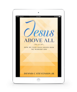
I won’t keep you waiting. Of the 30 people that gave feedback on the covers, 20 (66.66%) chose the third option. This is the newest one that I am in the process of rolling out.
So in that, I do feel a little bit validated. (whew!)
The other 2 options, were split evenly with five votes each. So that was pretty interesting.
I did enjoy the comments that were left. There was some really nice insight offered on all 3 covers.
Regarding option A (picnic table), someone offered “The second part of the title stands out more. Also, clearer than the other two which for me, look a bit too busy”
I agree. That version definitely had a well defined second part of the title in black.
Someone else said, “Simple but attractive.” and “It is to the point, and not an attempt to be flashy!” I totally get that. Simple was what I was originally going for, so I”m glad to see that hit the mark.
The middle cover was summed up really well by “It is clear, simply stated and uncluttered with attractive color combinations.” Again that’s nice to see because when I redid it, that was what I was shooting for.
My favorite (and most personally controversial) was “I’m not a fan of books that have ‘how to’ in the title! Sorry.” Don’t apologize. There’s no need for that. I really debated on adding the words “Learn how to” and “in just” on the third version… but it just seemed to help round out the title. I realize that it’s not everyone’s cup of tea, and that’s ok.
Obviously the third cover got the most comments.
- “More content on the cover expressing the book’s purpose.” – That’s what I was trying for!
- “Framing the book title brings into prominence The Bible on the cover” – Also something I was trying to do. I wanted the book to “pop” a little more and be more visible on the bookstore page.
- “I love the simplicity of ‘the upgrade’, but the ‘where it is now version gives more context and understanding for the buyer” – This was a great comparison and I take it to heart.
Overall the book has been out for almost 4 years and had 3 covers. I love that I can make the change and even explore with new concepts. All for the case of the Bible and getting more lifelong students out there.
I’m going through the last round of updating the books on Amazon. I had 5 different copies to update (ebook, paperback, large print, hardback and workbook). And of course, each one had a different sized cover that required unique work.
Next stop the other stores where it is posted (Apple, Google, Kobo, B&N and others).
It was a big task to undertake – and I’m “almost” done.
But I did want to say thanks for looking and leaving some feedback. It was kind of fun for me to hear what you had to say.
Next time, back to Paul and the First Missionary Journey!
Dennis